Background
BetterWorks provides continuous performance management to help employees easily set goals and give ongoing feedback. The platform connects the four aspects of a performance review process – goals, check-in conversations, peer feedback and reviews – to help organizations improve employee performance and engagement.
When I joined BetterWorks in 2014, the platform was little more than a few core features. Within my 3+ years working with the team, we built an entire suite of performance management software accessible across desktop and mobile, signing on hundreds of companies including a good chunk of the Fortune 500. We even won HR product of the year in 2015!
Because our product reached beyond the purely HR space into the operational space, there were a number of personas -- executives, managers, employees, talent leaders, and more -- to build for. Prioritization became our biggest challenge.
Problem
In Q4'17, through extensive user research, we identified a key usability problem—poor navigation was frustrating customers and causing them to churn from the product. We found that many pages in the app offered similar but inconsistent features and navigation. The results were excessively long session times to perform core actions, or users simply not logging in at all.
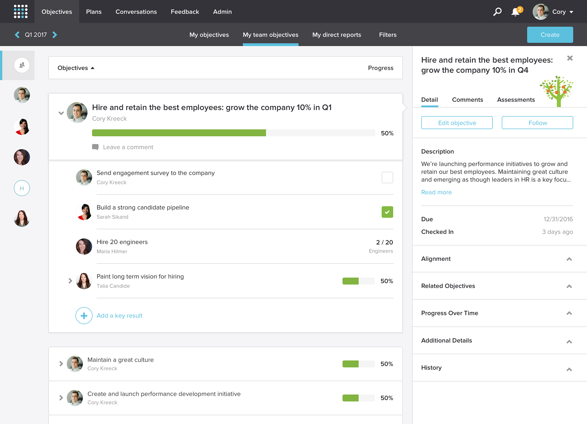
A few images of the old infrastructure
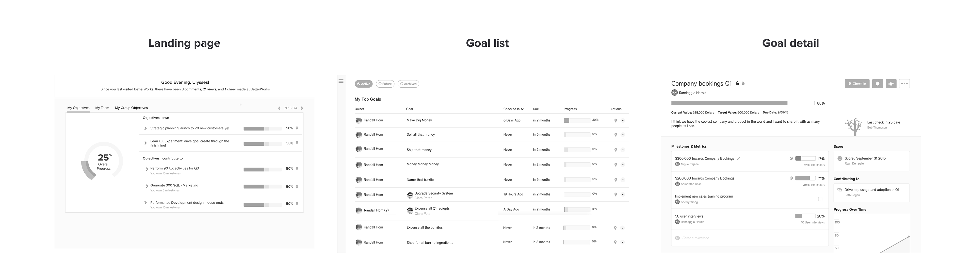
Initial wireframes
We began looking into a single page framework to lessen the friction it takes to load an analyze new pages. This would enable certain modules and panels to handle the load times, while maintaining a single layout.
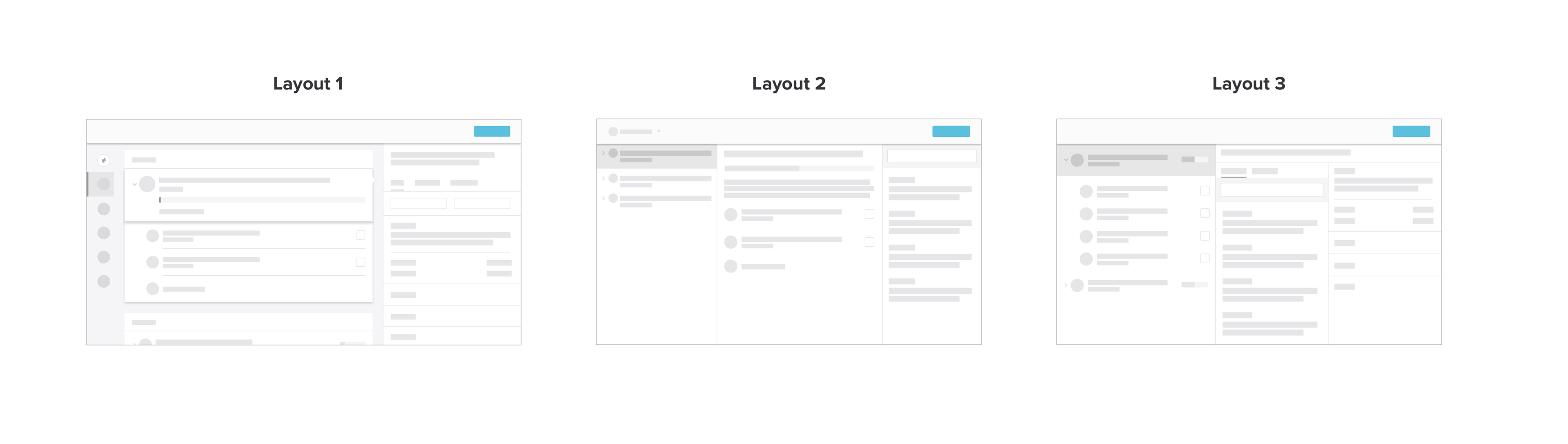
Using card sorting methodologies and looking at our user data, we determined the hierarchy in the image below was most intuitive to users when coming into the platform.
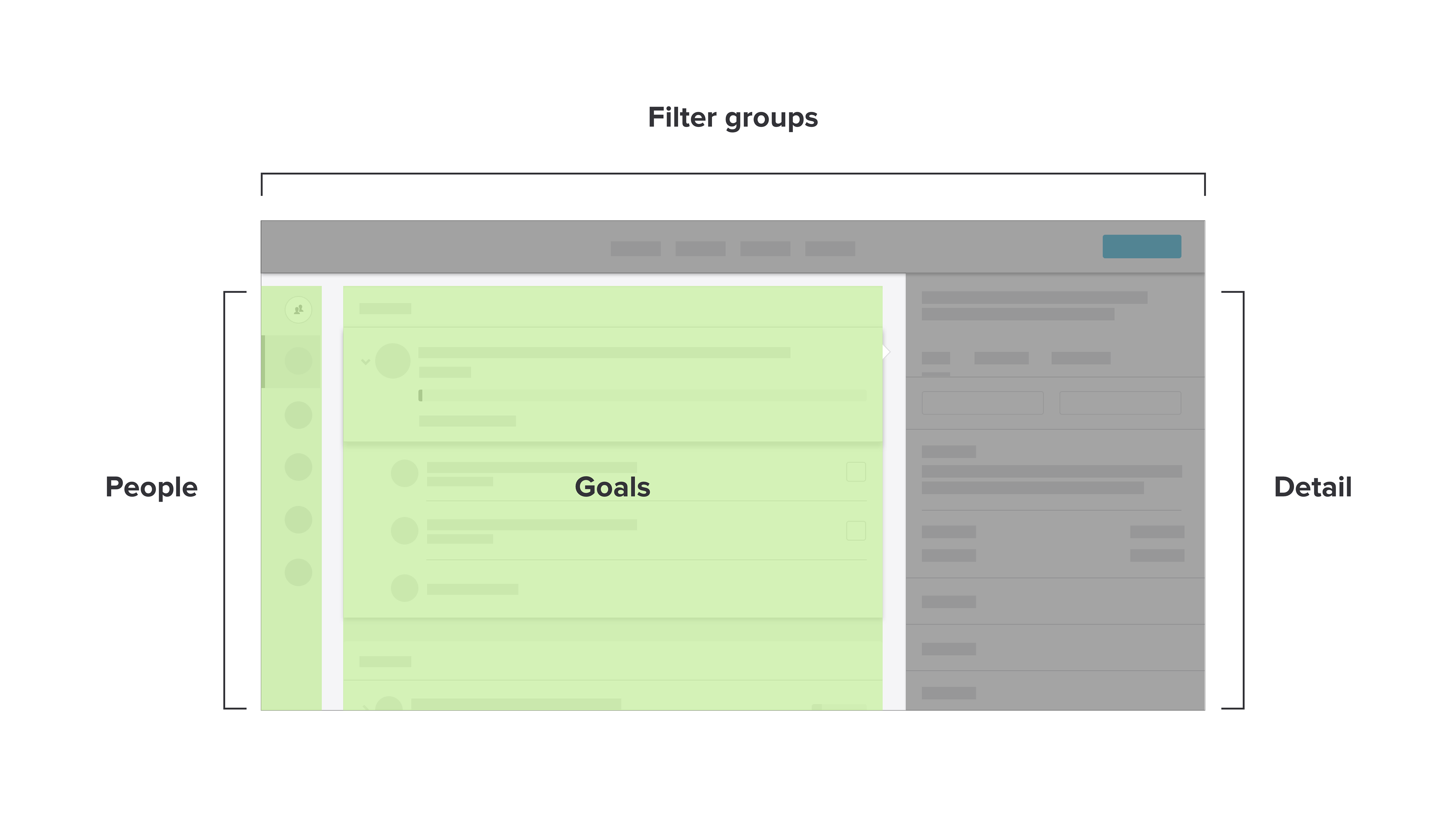
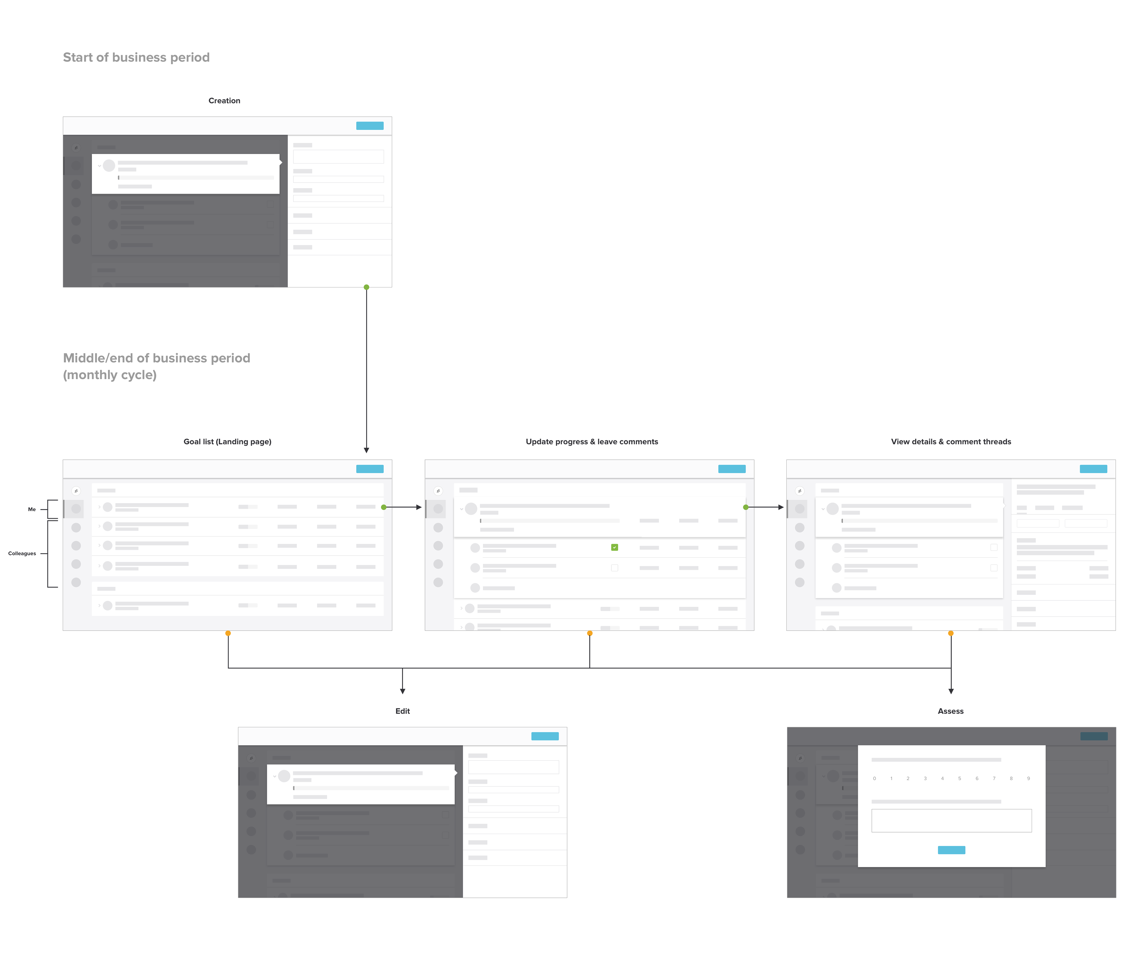
User flow
This user flow demonstrates how one layout can be leveraged to conduct core actions at different times of a business period, then pivot to interact with their team's goals.
High fidelity designs
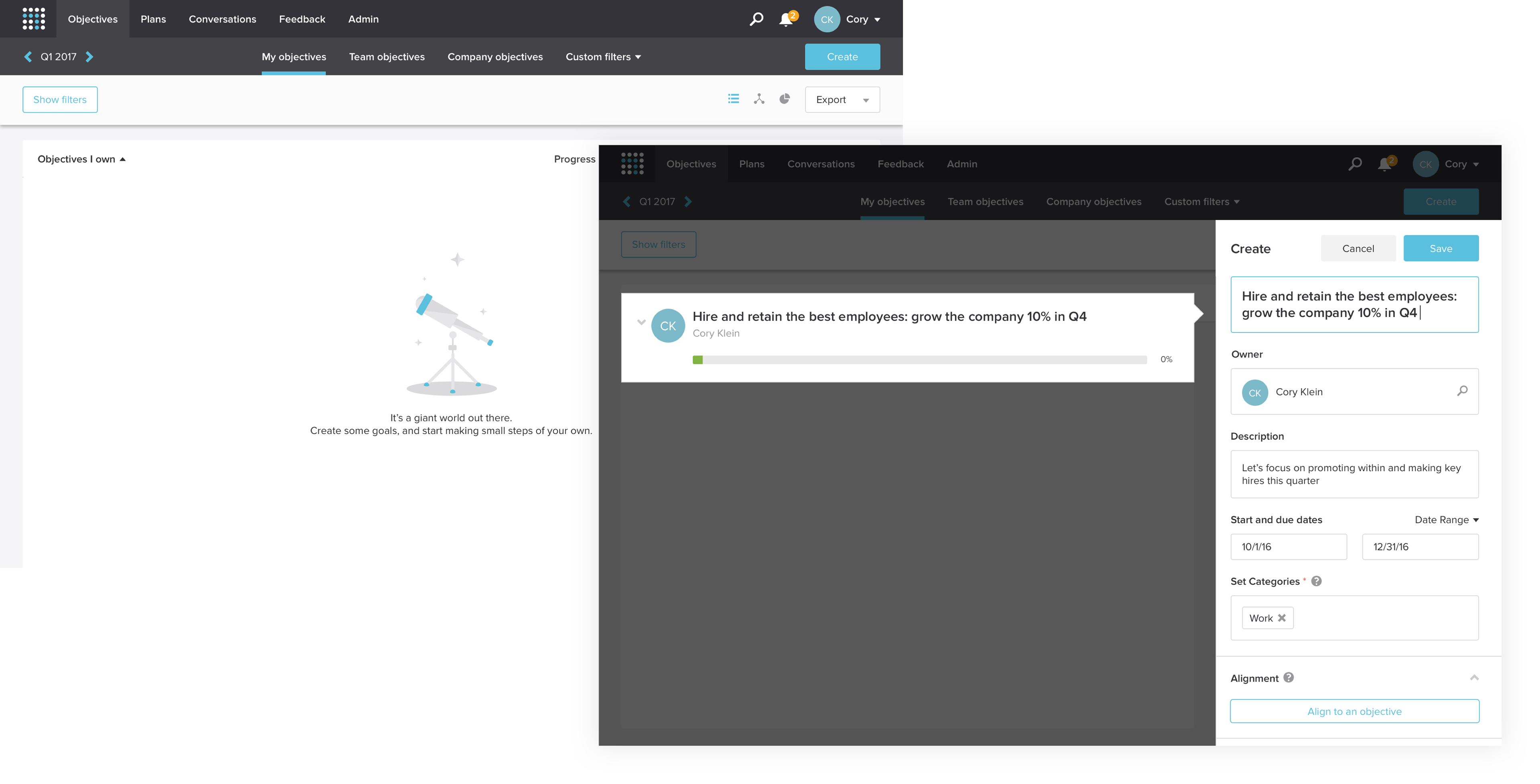
Goal creation
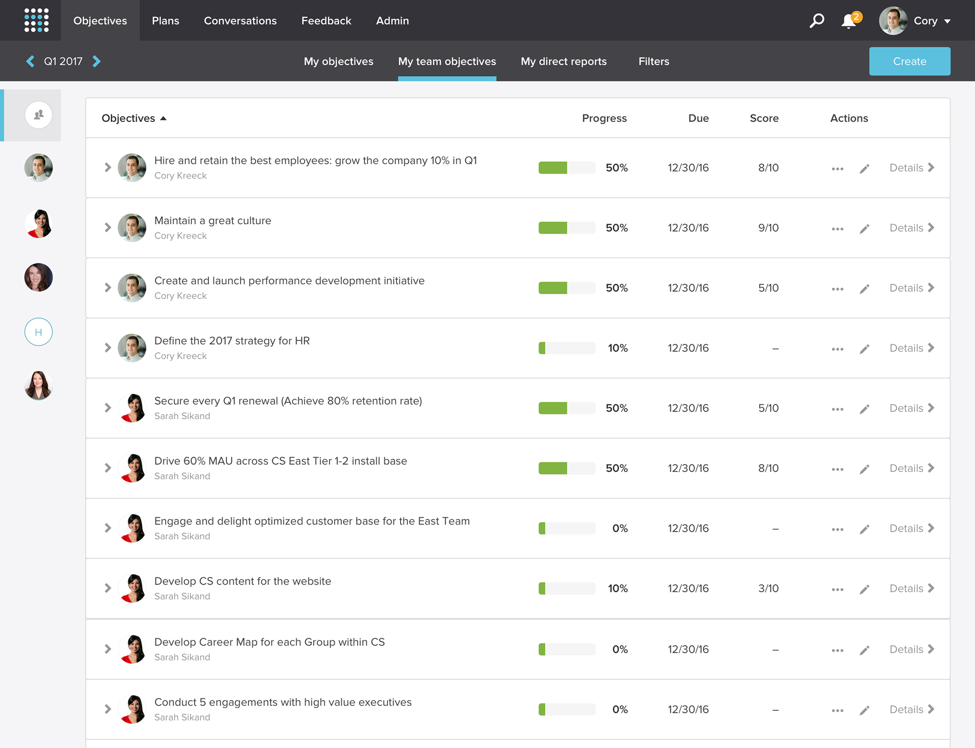
Team collaboration
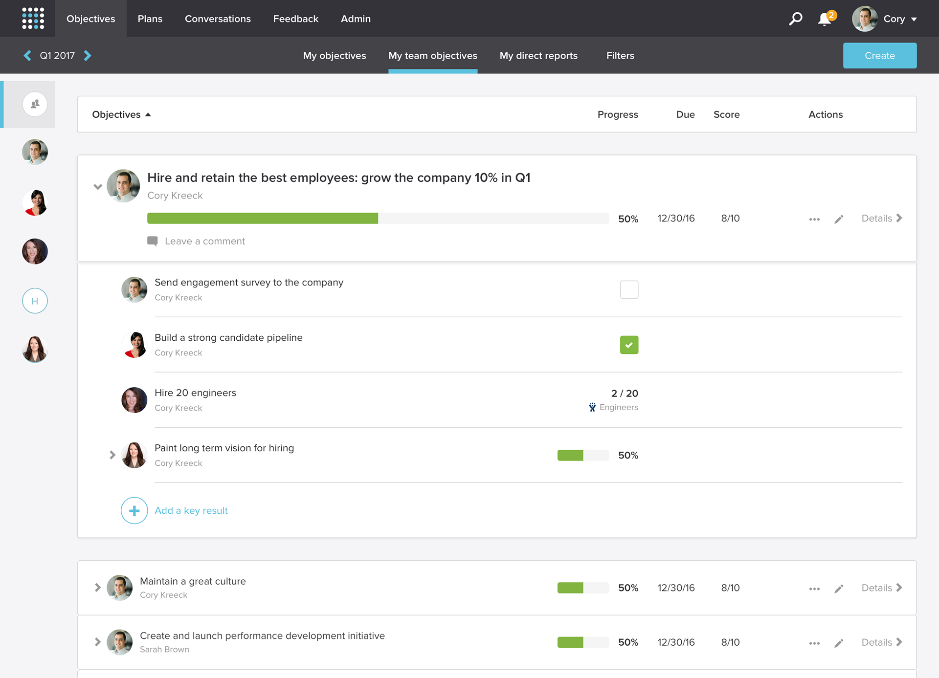
A user may click into a goal to see it's milestones

A detail panel slides in from the right, displaying comments and other tertiary information
Interactions
During early rounds of user testing we used Invision prototypes, but found without animated transitions creates cognitive friction. We needed a more robust tool to prototype, so I learned principle for mac to bring high fidelity prototypes to user tests.
This not only gave us more honest results, it prioritized animated transitions when it came time to develop.
Recording of the following interactions: opening a goal, updating progress, viewing & leaving comments
The team
Product manager – Tony Ventrice
Product designer – Randall Hom
User research – Ana Valera & Randall Hom
(With lots of help from Design, Product, Engineering, and CS ❤️)
Product designer – Randall Hom
User research – Ana Valera & Randall Hom
(With lots of help from Design, Product, Engineering, and CS ❤️)