
Opportunity
While companies typically map out their company structure, for many working in project teams or matrixed organizations, work is no longer hierarchical or siloed. What we saw, and continue to see, was that goals were accomplished by cross-functional teams, each providing their expertise. We had an opportunity to help companies map out how work was actually being done within their organizations.
First round of wireframes
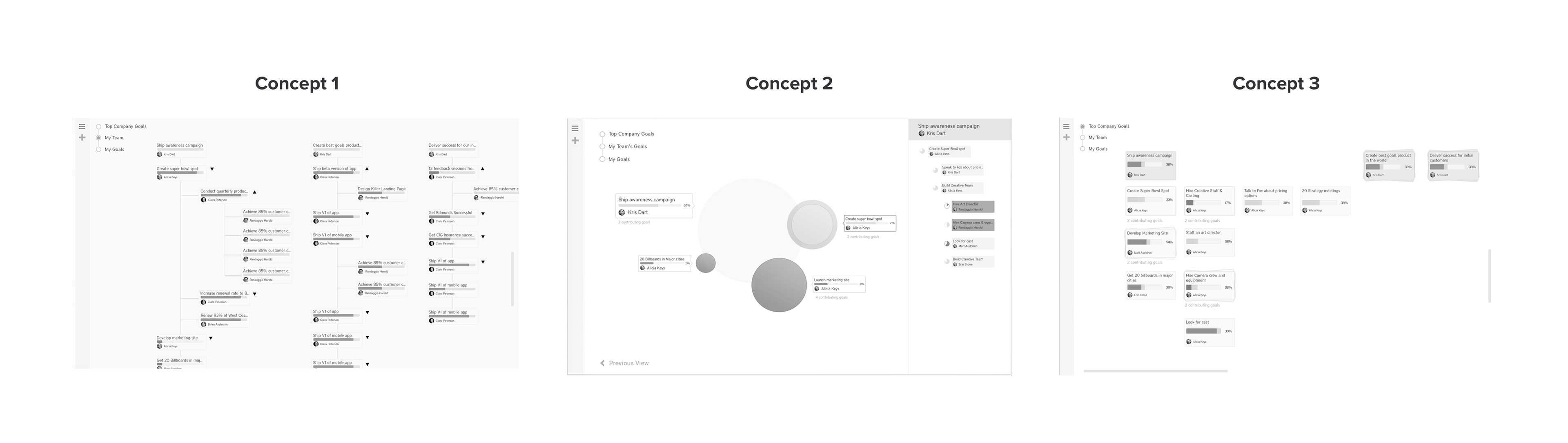
The team selected from a variety of potential use cases to focus on one value: transparency. Enabling anybody in the company to be able to browse and explore goals within the system provides an unprecedented levels of support and transparency.
Second round of wireframes
This time, the obstacles faced were more “design challenges” related to the platform. We had some goals that had 2 or 3 branches at the nodes. On the other end, we had a users with over 50+ branches. The designs of the goals would burst at the edges. My PM and I began to introduce constraints.
Constraint 1: Limit Pixels
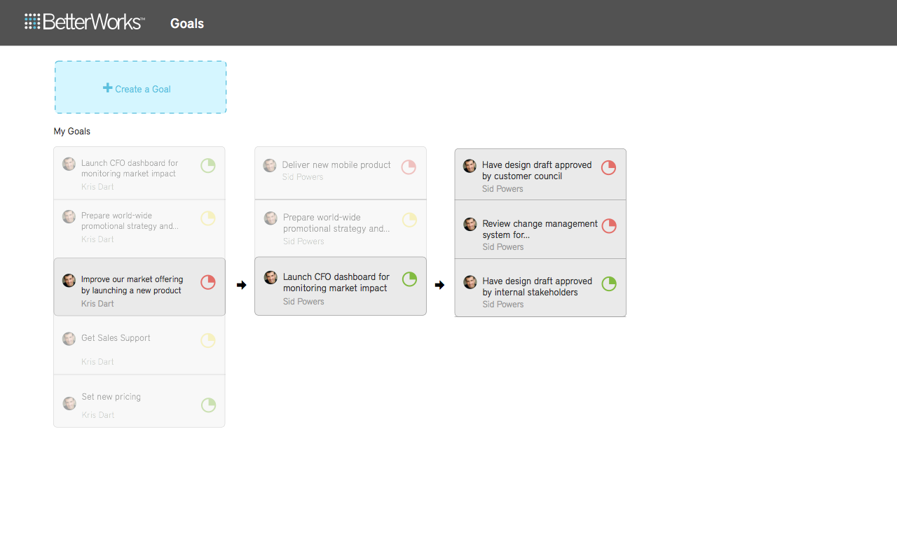
While the early design worked, we were spending a lot of visual space showcasing goals that were perhaps not so relevant and added noise. How could we be more ruthless with our pixels?
"A large share of ink on a graphic should present data-information, the ink changing as the data changes. Data-ink is the non-erasable core of a graphic, the non-redundant ink arranged in response to variation in the numbers represented."
– Edward Tufte
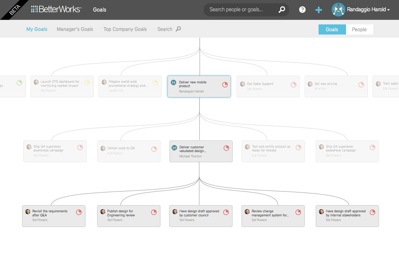
Constraint 2: Limit Rules
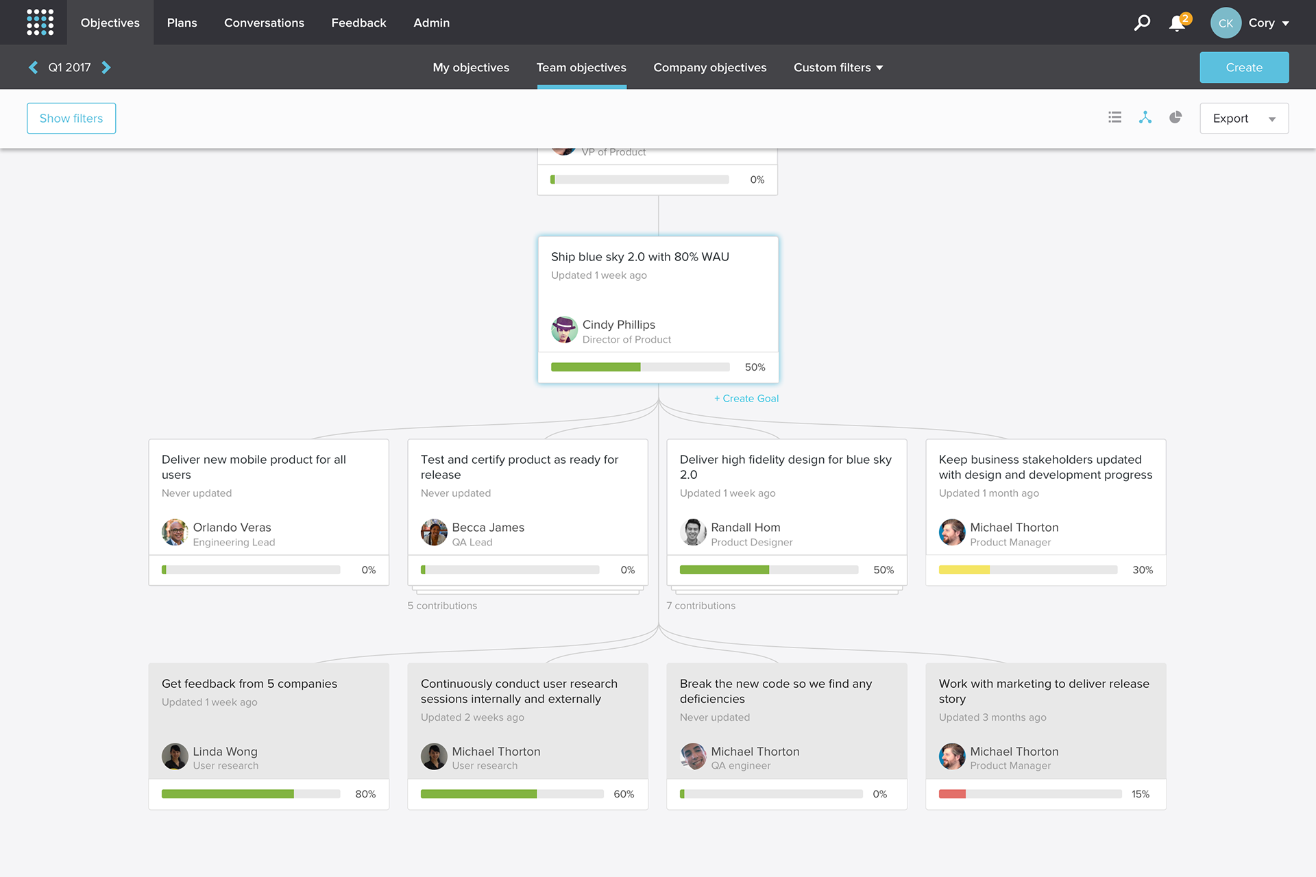
Showing connectedness was really hard as things kept getting lost. The breakthrough came when we came up with the concept of a “spine” that cut through all goals. A simple line down the middle solved balance, scalability, and provided a solid structure for showing alignment of goals.
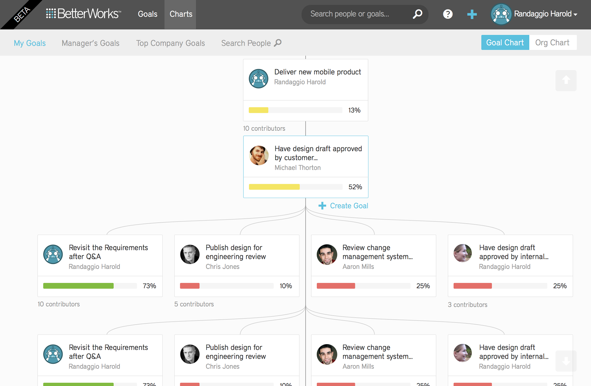
Interaction design
Final design
The team
Product manager – Vince Huang
Product design – Randall Hom
Product design – Randall Hom